
One of the first posts I ever made on this blog, which I wrote largely to try out the Substack post editor, was this one about the “scenes menu” in Space Fam, my recently released Firebrands / Our Traveling Home hack about being the crew of a space ship and processing your trauma together. In it I walked through the design of probably the most important page in the game: the list of scenes you can pick to frame when it’s your turn, which you return to again and again throughout play. Between that post and now, I landed somewhere pretty different from what the post was looking towards, so I figured I’d finish off the story in this update.
Before that though, if you like this kind of design deep dive, I’ve done a ton of it for Space Fam, and I’m going to keep doing more of it over the next week or two. The game comes with 8 past versions of rules for action sequence scenes, I did a bonus episode of Dice Exploder going over other details of the design, and there’s more posts like this one to come.
Okay, let’s take a look at the final scenes menu:
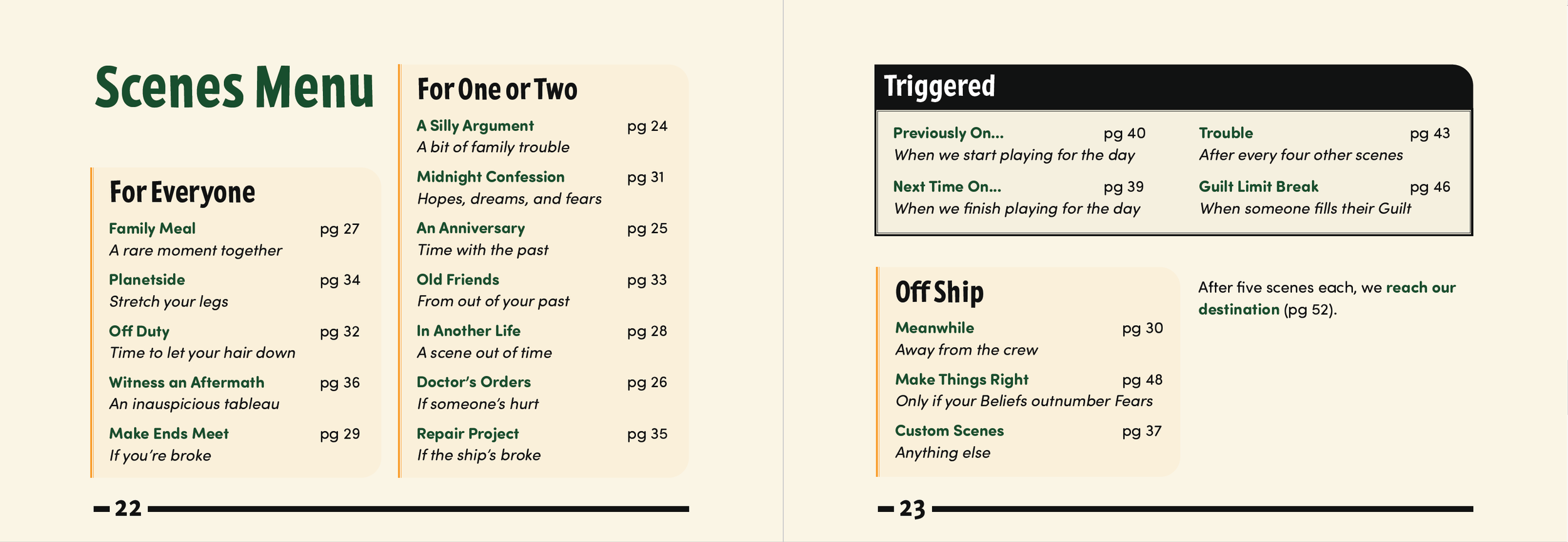
What happened! Where’d all the fun little boxes go? In some ways I miss this early version and how it subdivides the scenes, leaves more whitespace to keep you from getting overwhelmed.

What happened is that I kept showing versions to people, and they kept liking the ones that looked more like a classic restaurant menu than anything fancier. Some of the scene names were also long enough that they made the “little squares” aesthetic not work without changing the names of the scenes. Also, as I added more and more scenes and laid the game out in a small pocket sized format, the glorious white space that existed on that old version wasn’t sustainable, and with it went that design’s clarity.
Ultimately I decided to listen to my friends’ opinions on what looked good and legible rather than what I liked best visually. The black bar on Triggered Scenes draws the eye so you don’t forget about them, and there’s still a bit of whitespace to go around. I’d prefer it all be on one page instead of spread, and I probably even should draw up a version for the handouts that lives on 8.5x11 paper for easy printing instead of the pocket size we got here. Overall: I don’t hate it.
Looking back, it’s not that surprising I ended up with something that looks like a typical restaurant menu - if it ain’t broke, why fix it? If I do ever return to Space Fam for more updates, I’ll probably take another crack at this. But for now, this is the scenes menu in its final form.